

In this video· click a step to jump to it
Test recording
Maker Page — app walkthrough
89,071 ms · 288 pixels changed
We built this regression test for makerpa.ge — it's yours to keep, free.
Take this test with you
This is a real Playwright test, recorded against makerpa.ge. Claim it into your own workspace and re-run it on every deploy — free.
export async function test(page, baseUrl, screenshotPath, stepLogger) {
  const shot = (n, slug) => screenshotPath.replace('.png', '-' + n + '-' + slug + '.png');
  const UA = 'Mozilla/5.0 (X11; Linux x86_64) AppleWebKit/537.36 (KHTML, like Gecko) Chrome/132.0.0.0 Safari/537.36';
  await page.context().setExtraHTTPHeaders({ 'User-Agent': UA });
  await page.setViewportSize({ width: 1440, height: 900 });

  let postLoginActions = 0;
  const gate = /create account|continue with github|forgot password|sign in to maker/i;

  // ---------- Public phase ----------
  stepLogger.log('Public: marketing home');
await page.goto(baseUrl + '/', { waitUntil: 'domcontentloaded' });Checks run
Notes from the demo run
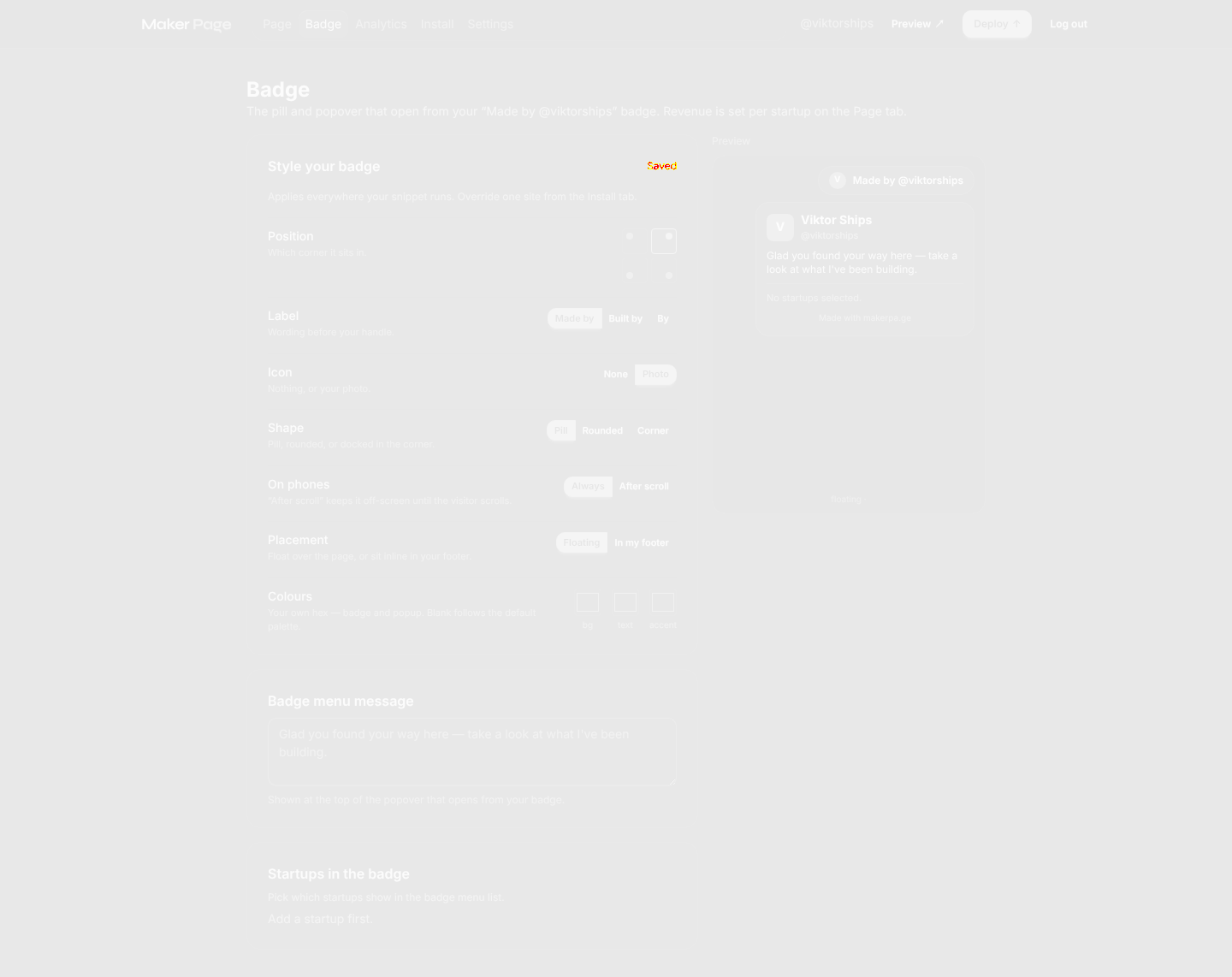
AI-generatedWe registered on makerpa.ge and drove your dashboard end-to-end: claimed a handle, wrote a bio, added a startup by URL, switched themes, restyled the badge, and walked Analytics, Install, Settings and the public preview. The thing that stands out is how little the editor asks of you before it shows you something — the phone preview on the right updates as you type, so the page feels real before you have decided whether to pay for it.
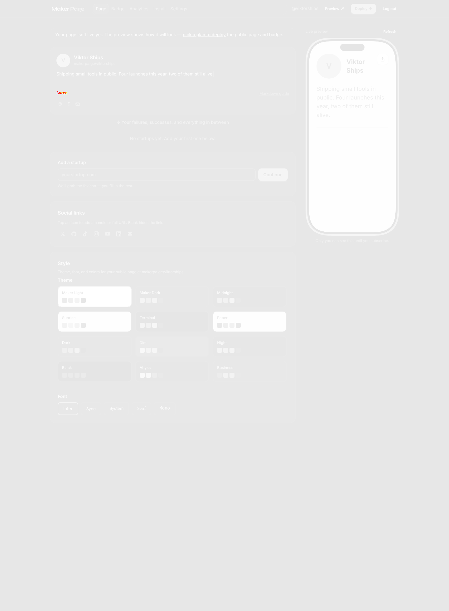
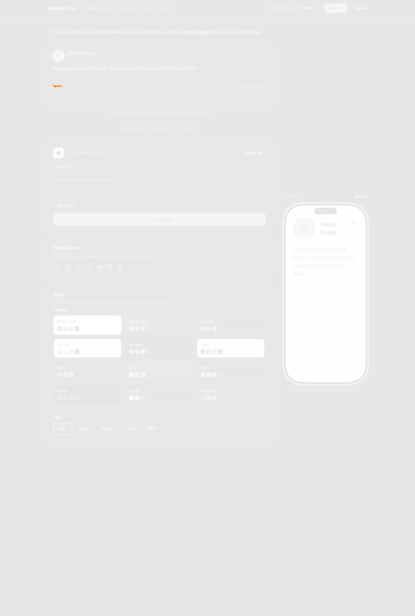
- Live preview earns its screen spaceThe phone mockup beside the editor re-rendered the bio and avatar as we typed, with an inline 'Saved' marker. Most maker-page tools make you click Preview; not needing to is the reason the first 60 seconds feel good.
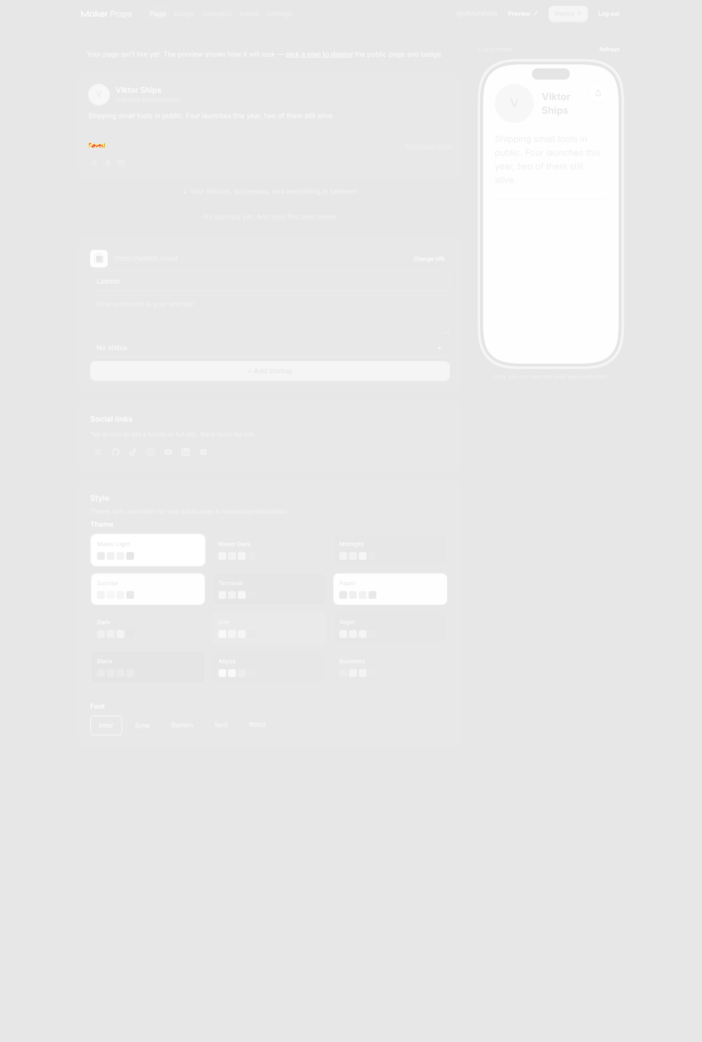
- Add-a-startup does the boring partWe pasted https://lastest.cloud and it came back with the favicon and the name 'Lastest' already filled — only the description was left to us. That is exactly the right split of work.
- Themes are a real choice, not a toggle12 themes and 5 fonts, each with a visible swatch row. Switching to Midnight re-rendered the preview instantly.
- /signup and /sign-up both 404Your registration page lives at /register only. Anyone who guesses the more common /signup (or follows an old link) lands on a hard 404 instead of your form. Two redirect lines in the router fixes it.
- The handle is permanent but nothing slows you downThe claim field says 'This cannot be changed later', then claims on a single click with no availability hint and no confirm step. A typo there becomes a permanent public URL — an inline check plus a confirm would cost you one dialog and save a support thread.
- /dashboard/deploy·Leads to plan selection and checkout — we never touch a payment flow on someone else's product.
4 visual changes








Share this run
Proof your app is not AI slop
This test was built for makerpa.ge — claim it free
One click copies the test and baseline screenshots into your own Lastest workspace. Re-run on every deploy and catch regressions before your users do — free, no card required.